The blog where I write things.

Latest

My Thoughts on Charles in Charge

Thanks to Netflix instant streaming on the Wii, I can watch any episode of Charles in Charge at any time.  And I have done some watching…

Not many have written about this show, but I have seen quite a bit of it, both now and back in the day.  Surprisingly, I enjoy it more now than when I was a kid. 

The show originally ran from early 1987 to 1990, but reruns ran for years afterward.  KTLA carried the show until at least the fall of 1995, since the last time I saw it was when I had just started 3rd grade.  My brother said it might have run an episode as part of its 60th anniversary marathon a couple years ago. 

What makes the show worth watching?  Nostalgia?  Not really, since it’s not any less funny now then it was when I was a kid; I think I appreciate the humor a lot more now.  Kitsch?  That would only make sense if the show were enjoyable in a so-bad-it’s-good way.  Despite whatever critics and observers say, I still think the show is enjoyable on its own merits.  The 80’s fashions and fads add a dimension to it, but at its core its basically an old-fashioned tv sitcom like many before and after it. 

What sets it apart?  The cast is the first thing.  Scott Baio manages to sell the character of Charles pretty well, especially considering some of the off-the-wall stuff that goes on.  Wille Aames’  “Buddy” character also holds up surprisingly well, an archtypal “lovable loser.”  The show also avoids one pitfall common to many sitcoms in the 80s and 90s:  it seldom made the mistake of taking itself too seriously.   For the most part, you didn’t see “very special” episodes or hear serious music at critical moments.  There was also light swearing and occasional (oblique) references to sex, both of which surprised me.  This is not the sort of show you’d see on the Disney Channel or Nickelodeon, which seem to try to portrey teens and adolescents as lacking the slightest concept of sex, drugs, or any of the things adolescents are exposed to in real-life. 

Another thing the show got right was that the characters were mostly likeable.  This is a common weakness in many of today’s sitcoms.  The later seasons of “Friends” are a good example.  The characters seemed to regress into childhood, becoming increasingly nasty, selfish, and immature.  Shows like that tended to have their humor undermined by gaping character flaws.  Maybe Bill Waterson was right when he said the sitcoms are often “a half-hour volley of vicious insults”. 

But back to Charles.  Long story short, Scott Baio made the show work.  He portrayed a character that was at once funny, likeable, three-dimensional, and sympathetic.  If you have Netflix, try an episode or two via instant streaming (the entire run is available for streaming).  If you keep an open mind and reasonable expectations, you might be pleasantly surprised.  Just skip the first season unless you’re a fan; it really wasn’t as funny as the later ones.

My Evaluation of the X-Entertainment MS Paint Contest

Hey everybody, I’ve been following X-E’s “Least Favorite TV Character Contest” with great interest.  The rules are simple: draw your least favorite TV character in MS Paint (or an equivalent program).  The response was enormous.  Here’s my judging criteria:

Technique:  How good is the drawing?  Also, does the drawing look like the character? 

Concept:  How good or original is the idea behind the drawing? 

Charm:  That “certain something” that makes a picture stand out, without regard to the previous categories. 

Each criteria is evaluated on a five-point scale, with the total making up the final score, with 15 being the maximum.  Without further adieu, here’s my reviews of each entry:

1) “Janice Soprano” by DJ D
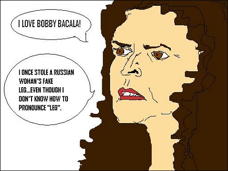
Our first entry.  Good line work, might have benefitted from more detail and color.  It kind of looks like it was traced from a phtotgraphic image.

Technique: 3

Concept: 3

Charm: 2

2) “Mr. Six” by IHAQ
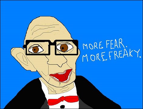
This is a good one, about as unsettling as the real commercial.  That always annoyed the heck out of me, too.

Technique: 3

Concept: 3

Charm: 3

3) “Snooki” by Mandy Reeves
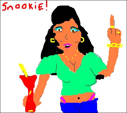
Hoo boy, this picture captures the character pretty well, considering it’s only slightly more cartoonish than the real thing.  The tan, another nice touch, was described by my brother as “clown orange.” 

Concept: 3

Technique: 2

Charm: 3

4) “Vince Offer” by Jugendsehnsuch
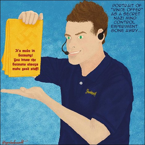
A masterpiece.  The Nazi angle is a nice touch, and the dollar signs in the eyes are an excellent detail.  The overall technique is superlative; this entry could easily pass for a real-life canvas painting.  The artist offers an animated GIF showing the making-of process, which helps you appreciate the work that went into it.

Technique: 5

Concept: 4

Charm: 3

5) “Steve Urkel” by penguin_poet
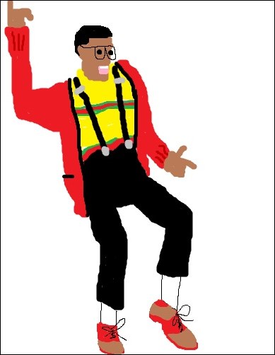
I like the jaunty “do the Urkel” pose, but as X-E Matt pointed out, this was taken from the Urkel-O’s box, which hurts the originality somewhat.  The colors are very acurate, though, and the overall likeness is very good.

Technique: 2

Concept: 2

Charm: 3

6) “Paula Deen” by PlantMonster
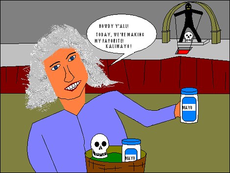
I’m not familiar with Paula Deen’s work, but the “Kalimayo” gag makes for an excellent “Temple of Doom” reference.

Technique: 3

Concept: 4

Charm: 3

7) “Janice the Muppet” by MORFNBLORSH
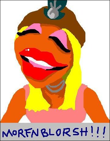
This is one of the best-drawn entries I’ve seen yet.  Has a layered, paint-like appearance that makes for an outstanding likeness, like a silkscreened poster. 

Technique: 5

Concept: 3

Charm: 3

8) “Randy ‘Not Eric’ From That ’70s Show” by Yohnny D.
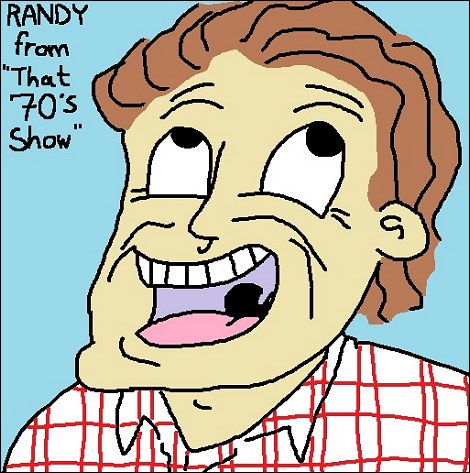
A classic example of a character added in a show’s twilight to replace a well-known lead.  He was only in the last season, so the artist gets bonus points for obscurity.  Also, he reminds me of Bruce Johnston of the Beach Boys.  If you watch “Live at Knebworth,” you’ll know what I mean. 

Technique: 3

Concept: 3

Charm: 3

9) “Scratch” by Class3KillStorm
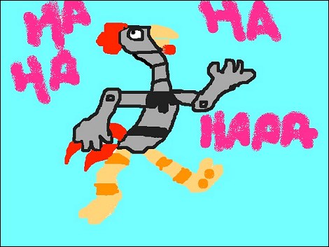
I saw this cartoon back in the 90’s and I kinda remember this chicken-like henchman of Dr. Robotnik (back when he was called Dr. Robotnik; why did they change it to Dr. Eggman?).  Good likeness, very recognizable. 

Technique: 2

Concept: 3

Charm: 3

10) “Steve Urkel” by Larry
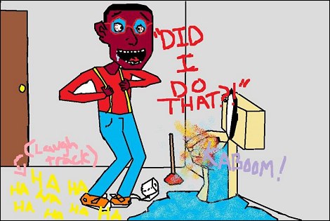
Another Urkel.  Admittedly, I didn’t think much of it at first, but the more I looked at it, the more it grew on me.  As I examined it, I asked myself: how do he clog the toilet?  Why is the toilet exploding?  And Why does Steve look like a speed freak?  The fact I was paying so much attention is a testament to the artist’s ability to infuse interest into ordinary material.  Last year, Larry entered a diorama into another X-E contest that had a Halloween theme, and it featured a “Winchester” action figure from MASH as a mad scientist.  It’s one thing to have a mad scientist, but to have one with a sarcastic wit and a pompous New England bearing is something else entirely. 

Technique: 3

Concept: 4

Charm: 4

11) “Michael from Salute Your Shorts” by Charles A.

I’ve heard of “Salute Your Shorts,” but I’m not really familiar with it (I originally thought it was some sort of cartoon).  However, this is an excellent picture because it pretty much tells you what the chracter is like even if you’ve never heard of him (and I haven’t): a dumb, wide-eyed jerk.  Actually, he kind of looks like a live-action Calvin. 

Technique: 4

Concept: 3

Charm: 3

12) “Vincent Chase as Aquaman” by Jerrod K
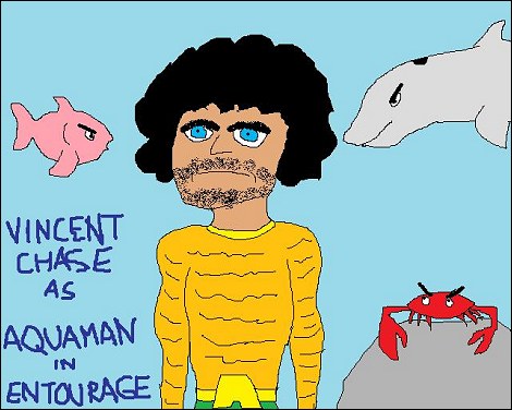
This is just plain funny.  Any number of people could’ve done Vince, but far fewer would actually have him dressed up as Aquaman.  It makes him look like an even bigger jerk than usual, taking the concept to a whole new level.  Excellent.  Even the fish hate him!  As I hear it, the joke is that Vince is actually famous for playing Aquaman on screen!  Man, that Aquaman cannot catch a break.  An entire cable show revolves around making fun of him. 

Technique: 3

Concept: 4

Charm: 3

13) “Uncle Joey” by Alex
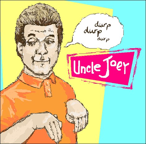
Excellent craftsmanship, but the likeness is a bit off.  To be honest, it looks more like Joe Piscipo then Dave Coulier.  The “durp durp durp” and accompanying hand motions are a nice touch. 

Technique: 4

Concept: 3

Charm: 2

14) “Uncle Joey” by Fox
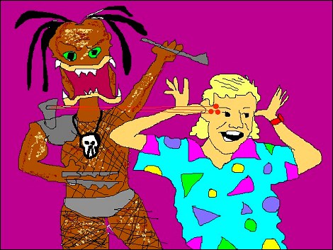
Here’s another Uncle Joey.  The picture may not be a tour-de-force, but the “Predator” angle helps it stand out.  I also like how Joey is doing his annoying schtick, completely oblivious to his impending doom.  Then again, he kind of looks like Howie Mandel. 

Technique: 2

Concept: 3

Charm: 3

15) “Shannon from Lost” by Cliff
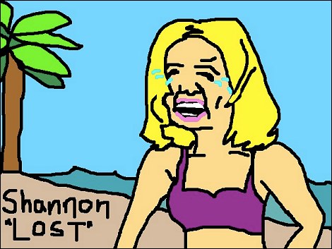
I was never a fan of LOST, but this captures the character pretty effectively, and expresses a good reason for hating her: she does nothing but stand around sobbing in a bikini top (or is it a brassiere?). 

Technique: 3

Concept: 3

Charm: 2

16) “True Blood Tara” by Dan
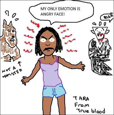
I don’t have cable, and if I did, I probably still wouldn’t watch True Blood.  However, I like this drawing because Tara looks like an angry Muppet.  When I look at it, I imagine her face shaking with rage and a tuba playing in the background.  I also like the fact that the monsters in the background are frightened of her. 

Technique: 3

Concept: 3

Charm: 4

17) “Vicki the Robot” by Lisa B.
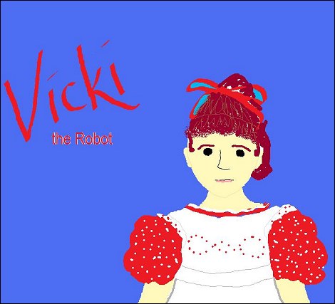
I used to watch Small Wonder a lot as a kid.  After viewing the recent DVD release, I was surprised at how much I liked the show after all these years.  Still, I can’t help but appreciate the detailing in Vicky’s hair, dress, and pinafore. 

Technique: 4

Concept: 3

Charm: 2

18) “Tori from SBTB” by Ed W.
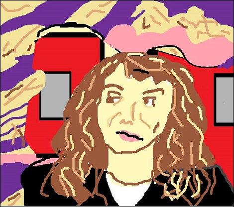
Here’s another obscure one: “Tori” only appeared for a brief period during the latter part of Saved by the Bell’s run.  I think X-E Matt had a crush on her or something.  This is another one of those pictures that doesn’t seem interesting at first, but kind of grows on you.  I think it’s due to Tori’s bored and/or annoyed expression.  It captures the character pretty much perfectly. 

Technique: 3

Concept: 3

Charm: 5

19) “Uncle Joey” by Louie Q.
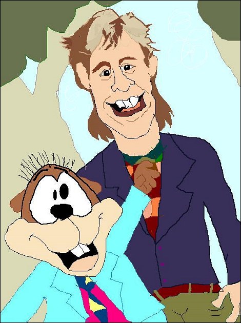
Boy, people really hate Uncle Joey.  I’m glad I haven’t seen Full House in such a long time.  The crowning touch is the inclusion of that woodchuck puppet he acquired at some point.  The likeness is somewhat better than the others, but something still seems a bit off.  The mullet is pretty funny, though (as most mullets are). 

Technique: 3

Concept: 3

Charm: 2

20) “Akumaro Sujigarano” by Neg
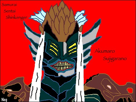
Here’s another one from left field.  Only hard-core Super Sentai fans are likely to recognize Akumaro Sujigarano, which I assume translates to “demon king Sujigarano” from the Japanese.  The likeness is excellent, with outstanding color detail making for a (presumably) high degree of accuracy (with repeated exposure, you get a pretty good general idea of what a Sentai villain should look like). 

Technique: 4

Concept: 4

Charm: 3

Thus concludes part I.  I’ll move on to the later entries before too long.  Matt from X-E will announce results around Wednesday, so to all my fellow entrants, good luck!

X-Entertainment MS Paint Contest Entry!

It took all night, but here it is.  For you readers out there, I’ll update this post with more making-of info later.  It’s a long story. 

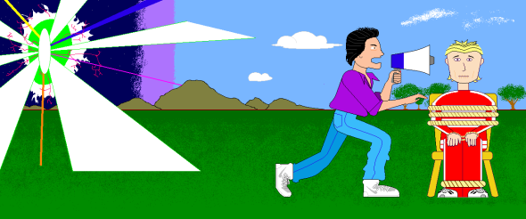
A true clash of titans.

Charles (In Charge) shouts at Sue Sylvester through a megaphone.

Title: “Back In Charge”

Description: When the contest came up, the “Glee” lady was the most odious TV character I could think of.  This started as a simple unflattering drawing, but then I thought: a jerk like her should get her comeuppance, and who better to deliver a comeuppance against my least favorite TV character than my FAVORITE TV character?  Who better to administer vicarious revenge than the man who’s in charge of our days and our nights, our wrongs AND our rights?  The idea was so simple, it practically drew itself.  The space-time anomaly in the background was included to explain how Charles entered the “Glee” universe.  As for why this is taking place on a grassy plain, adjacent to forrests and mountains?  Charles takes a lot of guff from the Powells, and he likes to get away from it all.  Besides, he’s the outdoorsy type.  One look at this and you’ll want Charles in charge of you, too!  Filmed in Panavision.

Darkwing Duck Returns… in Comic Book Form!

Darkwing Duck Returns!

The terror that flaps in the night...

Hoo boy, I wasn’t expecting this.  This is no joke.  BOOM! Studios is publishing a new Darkwing Duck comic.  According to wikipedia, the comic launched as a four-part miniseries and was successful enough to be extended into something continuous.  Who knew?  It was announced back in March and launched around June.  I won’t spoil the comic’s initial storyline, but the link provided will offer some insight if you’re interested.  When it comes to comics, I usually prefer to wait for the paperback.  However, this may be an exception, as I am a pretty big fan of the show (as are a number of my internet friends).  My hope is that renewed interest in the Darkwing Duck character might lead to a DVD release for the remaining episodes of the show.  So, to any fans of Darkwing out there, please consider a purchase!  Here’s a link to the article announcing the comic’s release: 

http://www.comicbookresources.com/?page=article&id=25219

My Summer Jukebox Playlist

It’s summertime.  Whether on the radio or on the net, around this time of year people think about what songs they like to listen to.  I probably have more fodder for this list than anybody.  As a lifelong oldies listener, I’m pretty hip to the well-known summer oldies. 

As you may have guessed, I have a Summer Jukebox playlist on my iPod.  It is currently composed of 135 tracks, 85 of which are by the Beach Boys.  I bet most of you didn’t know they had that many songs.  To be fair, many of the tracks are alternate mixes, a capella and what have you. 

Any way, I figured I might take a look at a few tracks and point out why I think they are appropriate. 

“Afternoon Delight” by the Starland Vocal Band- I know what you’re thinking: this song is about copulation!  Not necessarily.  This song was written at a time before every other word or phrase was a sexual euphemism.  I only started to hear this song within the last few years, but it’s so incredibly catchy that I could listen to it ad naseum.  Will Ferrell and company recorded a very funny (and surprisingly faithful) version of this song for the movie “Anchorman”.  It is also on the playlist.  Bonus points if you can identify a Simpsons joke relating to this song. 

“California Saga (On My Way To Sunny Californ-I-A)” by the Beach Boys- this was orginially part of a three-part suite on the Beach Boys’ “Holland” album of 1973.  The album was so named because it was actually recorded in Holland.  Different compilations have different versions: the original album version is slower than the single release, reportedly because of the European power supply that the original recording sessions used, resulting in a speedup when played back on U.S. machines. 

“Sunshine, Lollipops, and Rainbows” by Leslie Gore- featured in the movie “Ski Party,” you probably recognized this from the Simpsons, which is where I first heard it.  The episode was “Marge on the Lam.”  It really is as infectious as they make it out to be.

That’s it for now, tune in next time for more iPod-related adventures!

Whose Line Is It anyway? and the key to improv

I figured I’d start a new post while I’m still hopped up on Mountain Dew and orange whip (or as I like to call it, an Orange Avalanche). 

“Whose Line Is It Anyway?” is a show I used to watch a lot in my middle school years.  Going back to it on DVD, it holds up splendidly.  I daresay it’s at least as funny now as it was back then. 

But what makes it funny?  To make a long story short, I’d say it was the fact that these guys could pretty much do what they wanted.  Allow me to illustrate: When I was in high school, during a session of theater arts workshop (don’t ask), we were told that we would be doing improv that day.  Finally, I thought!  We can let loose and do the kind of stuff they do on “Whose Line”!  Yeah, right.  The teacher never let us go for more than a few seconds without stopping us for one reason or another.  In short, she never really allowed the jokes to play out or build up to anything.  That’s a problem I would encounter more than once in various classes.  Whenever a “creative” exercise is assigned, the creative decisions have already been made by the instructor.  In other words, there’s little room for real creativity at all.  Whether you’re learning piano, studying theater, or taking a writing class, it seems like you jump through an endless series of hoops without ever getting to do what you really wanted to do.  This may be one of the reasons that blogging is so popular.  This youtube clip illustrates how the guys on Whose Line managed to mine comedy gold out of almost anything:

Over the show’s run, a number of guest stars were featured.  Here’s an excerpt from a memorable episode featuring Robin Williams:

Hope you enjoyed!

Chaos at the Convenience Store

It’s  a hot summer day.  I have a dollar and change.  That’s right!  It’s off to the AM/PM for a soda!  Most convenience stores allow you to refill their drink cups at a discount.  At AM/PM you can refill a 64 oz. cup for $1.09.  Today they only charged me 87 cents for a fill-up!  My brother says that they run some kind of special on various days of the week, which is why the price seems to vary.  Anyway, on to the real story…

These days, convenience stores offer a pretty wide variety of sodas at their fountains.  The AM/PM down the street has about a dozen or so options, including Dr. Pepper, Pepsi, Coke (all three in regular and diet), two flavors of Gatorade, and various energy drinks.  I could have spent half an hour sampling the flavors before I made up my mind (and I almost did!).  This time, however, I found something I hadn’t noticed before. 

Ever have an orange whip?  The only other place I’ve seen them is at a Mexican restaurant.  Having a taste, I immediately realized what made it so tasty: it was basically an orange-and-cream popsicle in soda form.  It was so sweet, I had to dilute it.  So, I added Mountain Dew in roughly equal proportion.  The mixture worked fairly well, since Mountain Dew has sort of a citrus flavor, and the orange whip was so strong that I could still taste it very clearly. 

When I mixed the two together, I noticed that it was unusually foamy, no doubt the result of some kind of chemical reaction.  I saw something similar when my Dad mixed Mountain Dew with milk.  My brother says that the foam is essentially cheese.  When my stomach started gurgling after only a few sips of this curious mixture, I knew I was onto something. 

All in all, I love the taste of orange whip, and mixing it with Mountain Dew helps dilute it without ruining the flavor.  If you get the chance, I recommend giving it a try.  Be warned, however: this stuff is sweet enough to burn the back of your throat.  If you try it, you might want to stick to a 20 oz.-or-smaller cup.  You know what?  I just realized that this would make an excellent float if I were to scoop some French Vanilla ice cream into it…

What’s with the Coke Bottles?

Today I went to the store for a two-liter Coke.  When I got to the soda aisle, I noticed something odd.

It's not a good sign that I find this so interesting...

Please excuse the poor photgraphy.

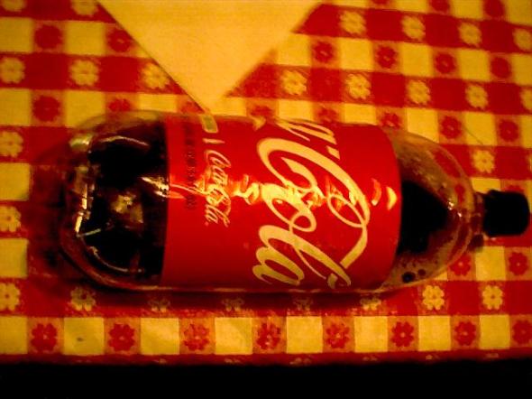
 The Coke bottles had black lids!  Mind you, this was Coke Classic, not some Diet or promotional flavor.  Just plain old Coke.  My digital camera is pretty cheap, so here’s a wider shot that will hopefully illustrate it better:

I hope I didn't uncover some far-flung conspiracy involving Fidel Castro and the cast of "Days of Our Lives"...

Another testament to my photographic prowess.

I’ve been drinking Coke for a long time, and I’m pretty sure Coke bottle lids have been red since at least the 1990s.  They may have been other colors at various times and places, but I’m so used to them being red that it’s a shock to see a sudden switch to black lids without any fanfare, especially since Coke has a habit of altering its appearance every few years to draw attention to itself.  (Remember the period a few years ago when Coke had a stylized logo with a little yellow stripe running through it?  That was a cool design while still being true to the old logo.)  I noticed that some bottles on the shelf had black lids, while others toward the back had the normal red ones.  Maybe it has something to do with a local bottler.  Anyway, I thought I’d write about it while I still had the interest.  In the comments, feel free to let me know if this sort of thing has happened in your neck of the woods.

Finally! Actual content!

It took me hours and hours, but I finally got everything working reasonably!  Text is readable, my custom background collage is visible, and the layout is not too cluttered.  Special thanks to Jason for being my first poster!  Thank you for your support!  Thanks also to Matt from X-Entertainment and all the regular posters on that blog.  Now that I’m finally ready, I’ll start things off by giving you a general idea about what subjects I plan to cover:

Television

Video Games

Toys

Art/Writing

Potpourri (anything that doesn’t fit in the other categories, and assorted trivia)

This is not a definitive list, as I will doubtless branch off into whatever subjects strike my fancy.  You can check the categories or run a search at any time, as I may add new content that fits into a very sepcific area of interest for you.  Now, I’m finally ready to do what I set out to do and write about… things.

It took me 8 hours…

…but I finally got a viable theme worked out!